When good isn’t good enough,
it has to feel right.
Some would say, you can’t put a price on doing the right thing. This is something we put into practice recently at KYAK, after we took on a pro bono project for a Newark-based fitness instructor specialising in rehabilitation training.
Following a recommendation from a previous client, we were put in touch with Adam Savage, AKA Gorilla Man Fitness, whose specialism in supporting people with brain injuries and physical disabilities comes from his own personal experience of overcoming both. Once we had heard the incredible journey the story of his life had taken him on, we felt compelled to support him with the update of his brand identity as he took the next step by becoming a Community Interest Company (CIC).
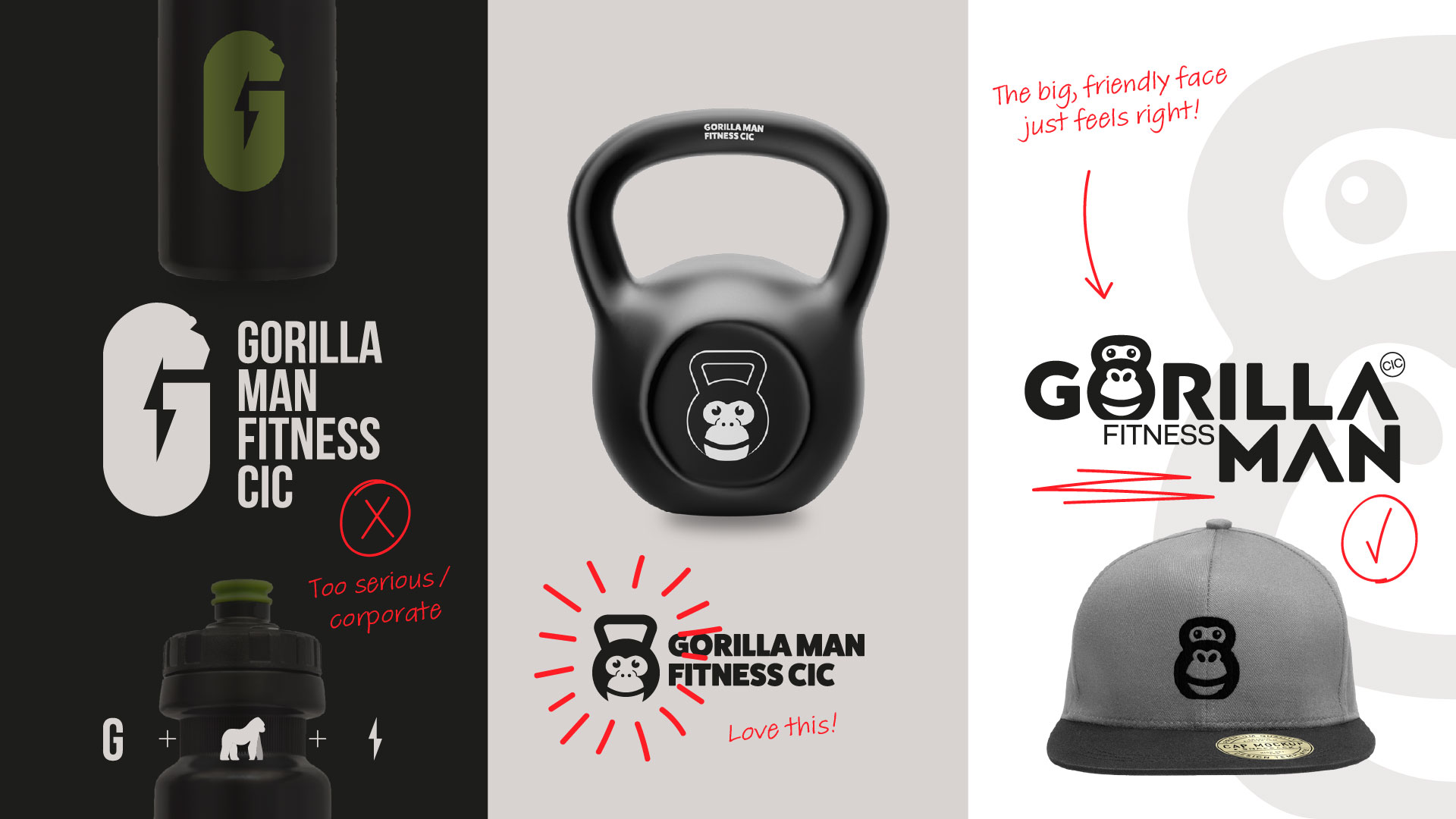
During my initial chat with Adam, as we discussed how he envisaged the look and style of his new identity, he referenced the t-shirt he wore most days as an unofficial uniform, which featured Eddie Hall’s The Beast™ logo in bold black and white. This bold, minimal style is commonplace in the fitness industry, and one that Adam was naturally drawn to, which is most likely why it influenced his vision of how the new Gorilla Man Fitness identity could/should look.
This key piece of insight was enough to spark an initial idea — as is often part of my creative process — which I believed ticked all the boxes and had the potential to perfectly depict the business and really stand out and raise his profile in the fitness industry. But as good as this idea was, it was based on one biased viewpoint. While his was perhaps one of the most important viewpoints, this still didn’t consider the other most important point of view… his audience.
Following some further research, it was clear his audience were not looking for big, bold, masculine brand that would sit perfectly alongside gyms or health supplements. They would more likely be looking for a friendly face with the professional skills and experience to support them with their specific injuries or illnesses. Thankfully for us (and Adam’s audience), we had the breadth of ability in-house to deliver exactly that.
It was time for the rest of the KYAK team to bring their more considered ideas to the table. Both Rob and Mia developed and put forward their own ideas, which we all critiqued as a group and selected 3 final concepts to present to Adam. This included an idea from each of us, making it very much a team effort.
The concepts were presented to Adam, and all were warmly received. As expected, my initial idea was liked but it was a case of “it’s good, but not quite right”. The other two concepts were clearly much closer to the mark and required Adam to take them away to share with his inner circle and give further consideration before he could reach a final decision.
Just a day or so later we heard back from Adam, and he had made his final choice with no further changes required. As a team, we very much nailed it first time. Our time, thought and expertise were given free of charge because it felt like the right thing to do. Just like the chosen design just felt right for Adam.
To see the final brand we created click here to take a look at our project page…


