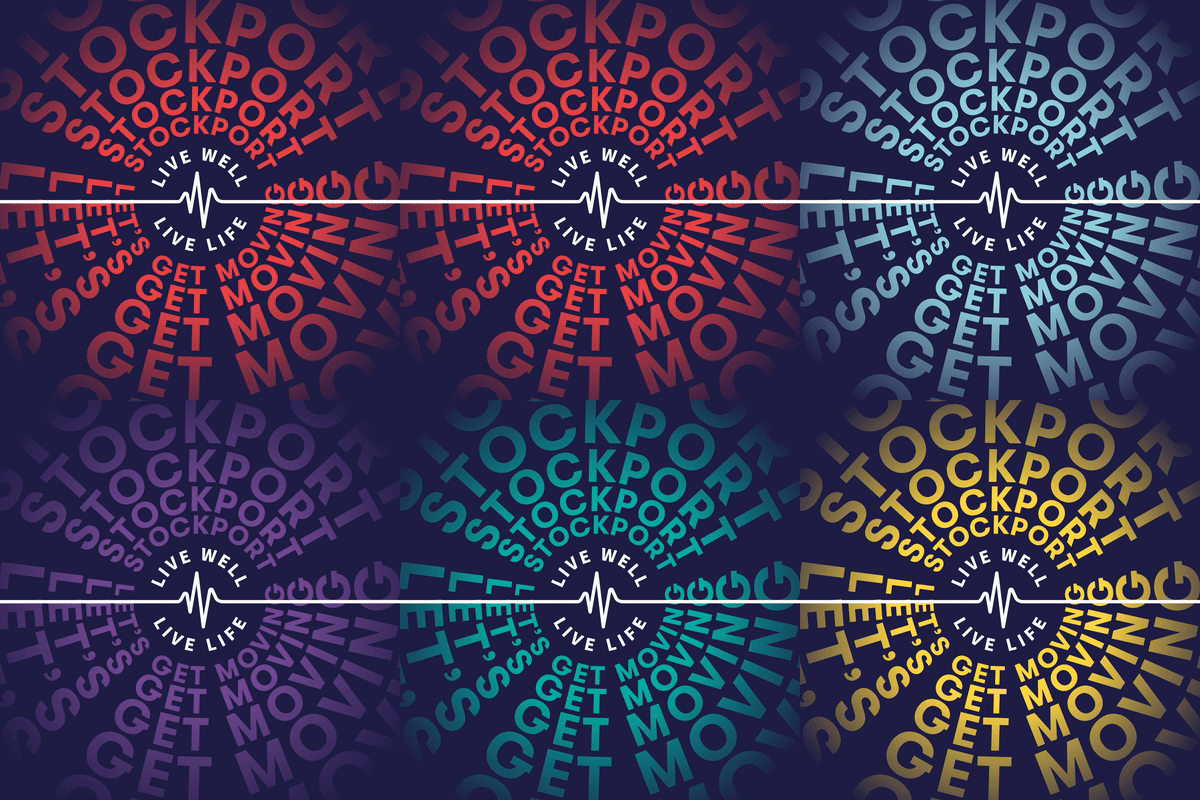
CREATING A MARKETING CAMPAIGN FOR LIFE LEISURE
We were asked by Life Leisure to produce a marketing campaign for January that not only introduced the updated brand that we had recently developed for them, but that also introduced a more localised message.
CREATING ASSETS
The Life Leisure photo library needed some updating before we could begin putting the campaign together. We undertook a two day photoshoot at a couple of their leisure centres photographing real people using the facilities. This then enabled us to progress the development of their marketing materials.

DEVELOPING THE CAMPAIGN
Our brief was to encourage the entire borough of Stockport to use the Life Leisure facilities and programmes to ‘get moving’. At the same time it was the first opportunity to introduce the updated brand style we had developed for them.
We tackled the project in three phases, the first of which introduced the campaign in a bold and striking way, the second phase added to this by being more specific to the individual centres (or hubs as they’re known) and the activities on offer. The third and final stage, which at the time of writing is yet to be deployed, is even relevant to individual areas of Stockport that Life Leisure serve and how the people of Stockport can get involved whether they’re a member or not.
Assets covered digital as well as traditional print. Shown here is an animated launch graphic designed to create intrigue and interest!

The two posters below show the campaign evolution from phase 1 to phase 2. Phase 1 introduces the overall message and the Life Leisure mantra of ‘Live Well, Live Life’. The heartbeat device within the Life Leisure logo was used to cement this phrase creating a symbol and common thread across all executions .
The Phase 2 poster is more specific to an area of Stockport where Life Leisure operates a ‘hub’ introducing a real, and relatable, customer image from the recent photoshoot. The colourway also moves from a core brand look with blue as the dominant colour, to a more engaging and visually striking use of the brand red and blue.
![KYAK PROJECT CONTENT_LL_Poster1[square] Life Leisure Jan Campaign poster Phase 1](https://kyakstudio.com/wp-content/uploads/2025/02/KYAK-PROJECT-CONTENT_LL_Poster1square.webp)
![KYAK PROJECT CONTENT_LL_Poster2[square] Life Leisure Jan Campaign poster Phase 2](https://kyakstudio.com/wp-content/uploads/2025/02/KYAK-PROJECT-CONTENT_LL_Poster2square.webp)
Of course no marketing campaign is complete without its social elements. We provided Life Leisure with a range of assets they could deploy across their social channels, shown here are just a couple of examples.
![KYAK PROJECT CONTENT_LL_Socials[square] Life Leisure Jan Campaign Socials](https://kyakstudio.com/wp-content/uploads/2025/02/KYAK-PROJECT-CONTENT_LL_Socialssquare.webp)
A wide range of print items have also been created, from tote bags to pull up banners, leaflets to flyers, pull up banners to button badges!

![KYAK PROJECT CONTENT_LL_Leaflets[square] Life Leisure Jan Campaign leaflet](https://kyakstudio.com/wp-content/uploads/2025/02/KYAK-PROJECT-CONTENT_LL_Leafletssquare.webp)


